The Washington Post ran a cute article titled “The hottest trend in Web design is making intentionally ugly, difficult sites” this week. In it, author Katherine Arcement writes about European graphic designers doing the darndest things–like programming websites to intentionally look old! Read Arcement in full here.
There’s an interesting trend in Web design these days: Making websites that look, well … bad.
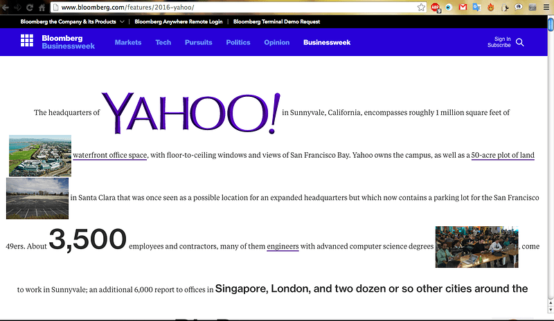
Look at Hacker News. Pinboard. The Drudge Report. Adult Swim. Bloomberg Businessweek features. All of these sites — some years old, some built recently — and hundreds more like them, eschew the templated, user-friendly interfaces that have long been the industry’s best practice. Instead they’re built on imperfect, hand-coded HTML and take their design cues from ’90s graphics.
The name of this school, if you could call it that, is “Web brutalism” — and there’s no question that much of the recent interest stems from the work of Pascal Deville.
In 2014 Deville, now Creative Director at the Freundliche Grüsse ad agency in Zurich, Switzerland, founded brutalistwebsites.com. He meant it as a place to showcase websites that he thought fit the “brutalist” aesthetic: Design marked by a “ruggedness and lack of concern to look comfortable or easy” in “reaction by a younger generation to the lightness, optimism, and frivolity of today’s Web design.” (In architecture, brutalism describes a ’70s architectural movement characterized by large buildings with exposed concrete construction.)
