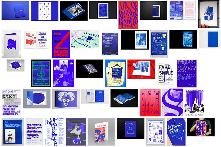
For Loki Design, Kevin Yuen Kit Lo writes about the Pantone Colors of the Year, Rose Quartz and Serenity, and how they, like previous colors of the year, have been plucked from counterculture aesthetics. He claims that Rose Quartz and Serenity have been popularized by Vaporwave (early computing aesthetics popular on Tumblr and successor to Seapunk), and that 2008 color of the year Blue Iris ripped off the Dutch “default design” approach of the early 2000s. Read the full piece here, or an excerpt below.
Aesthetics can be understood as the system of a priori forms determining what presents itself to sense experience. It is a delimitation of spaces and times, of the visible and the invisible, of speech and noise, that simultaneously determines the place and the stakes of politics as a form of experience. Politics revolves around what is seen and what can be said about it, around who has the ability to see and the talent to speak, around the properties of spaces and the possibilities of time.
— Jacques Rancière, The Politics of Aesthetics
Questions of representation are central to the practice of graphic design. An understanding of who we are speaking for, and who we are speaking to, is the starting point of any design brief. It is through this role of mediation, expressed as aesthetic form, that design enacts its power and responsibility. However, this mediation often happens uncritically, guided by a designer’s intuition, stylistic trends, and the instrumental framework of marketing and PR concerns. A multiplicity of factors, conscious and unconscious, play into a designer’s aesthetic choices of imagery, typography, composition and colour. And as much as some might argue to the contrary, none of these choices are neutral.
In the case of colour, Pantone Inc. holds incredible influence with their increasingly marketed and mediatised Colour of the Year campaigns. Purportedly determined through a prescient reading of the cultural zeitgeist (by a select cabal of colour specialists), it is important to understand that the company, and the industry it serves, have their own specific interests and agendas that drive these selections. Pantone’s choice of “Rose Quartz” and “Serenity” as the 2016 Colour of the Year is the most insidious move by this colour-industrial-complex since “Blue Iris” in 2008. As with “Blue Iris”, Pantone has once again mined the subcultural landscape and used their monopoly within the creative industries to propagate their colour properties to the world.
From IK Blue to Blue Iris
Pantone was on point in 2008, presenting a slightly muted version of the IK Blue (International Klein)/RGB Blue trend that evolved out of the Dutch “default design” approach of the early 2000s. Default design advocated against the smooth surfaces of graphic professionalism, employing low-res imagery, system fonts, crude layouts, and the standard web link hex-colour #0000FF. It incorporated a self-referential criticism into its aesthetic, and the prominent use of RGB Blue became a clear signifier of this. The colour was carried forward with the emergence of a vaguely defined “critical graphic design” aesthetic, shifting between Default, IK, and Reflex Blue, and it was often used monochromatically, in large flat swathes that were both vivid and jarring.
Though IK Blue and RGB Default Blue are not the same, their intense visceral effect is similar, stemming from the colours’ physical/digital materiality; Klein’s blue was unique due to the synthetic resin binder which allowed the pigment to maintain its clarity, whereas Default Blue is as pure a blue as the RGB spectrum can achieve. Referenced in William Gibson’s 2010 novel Zero History, the character Hubertus Bigend has a suit made entirely of material in IK Blue. He states that he wears this because the intensity of the colour makes other people uncomfortable, and because he is amused by the difficulty of reproducing the colour on a computer monitor. Gibson, an astute cultural observer, used this reference to acknowledge its avant-garde popularity while pointing to the inherent subversive quality of the colour.
http://static1.squarespace.com/static/5391d95de4b098aaf51595fc/t/56cb3ddd2fe131be1e677b41/1456160222550/Jacquemus_Blue.jpg?format=1000w
Jacquemus Blue on Google Images
The mainstreaming of “Blue Iris” by Pantone softened the subversive punch of IK Blue (which by 2008 was already an identifiable commodity in contemporary art and fashion circles), further bolstering its popularity amongst designers and the consumer population at large.
Rose Quartz and Serenity
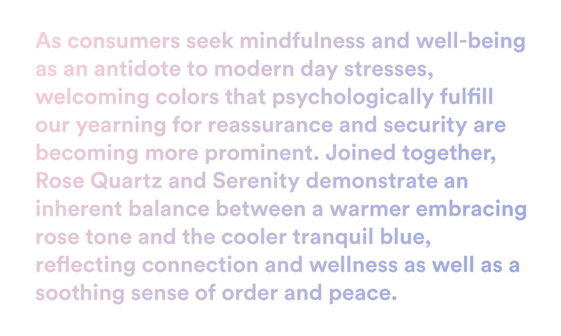
Pantone Colour of the Year 2016 release copy
“Rose Quartz” and “Serenity” (hereafter abbreviated as RQ+S) present a far more nefarious situation. There’s no doubt that Pantone’s trend forecasters/cool hunters are once again on point (much more so than last year’s Marsala), yet anyone who has spent a little too much time on Tumblr over the last few years probably could have seen this coming. The tonal pink and blue palette has been growing exponentially in popularity online since the emergence (circa 2010-11), purported death (circa 2012), and expanding influence of the micro-cultures of Seapunk, and its successor, Vaporwave, as part of a more broadly defined subculture of internet-fuelled art employing what can be described as a Tumblr aesthetic.
The popular use of these colours, and specifically their combined usage, has emerged out of a tumultuously contested subcultural space. Pantone’s conceptual framing of RQ+S is disingenuous at best, and once one digs a little deeper, can be seen to represent a clearly reactionary political force.


