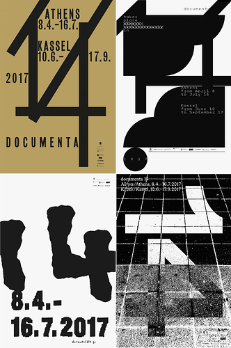
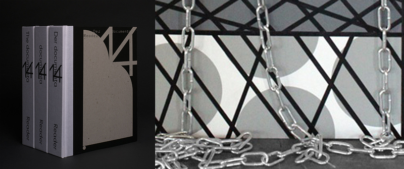
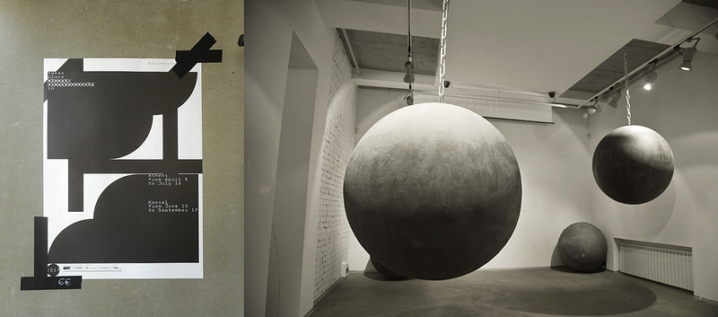
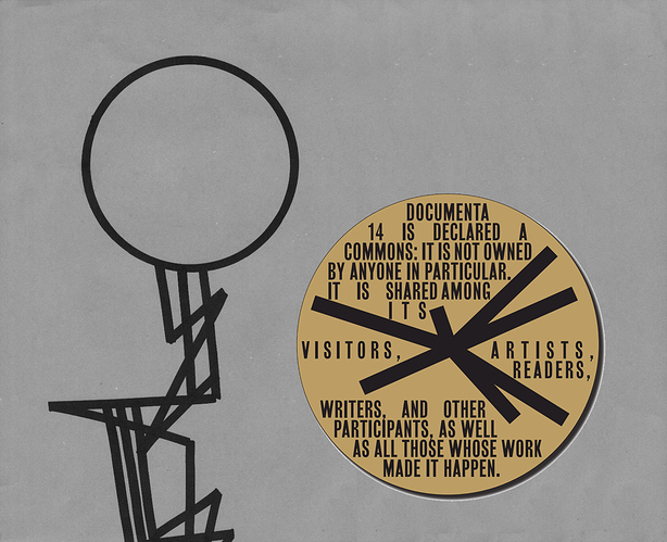
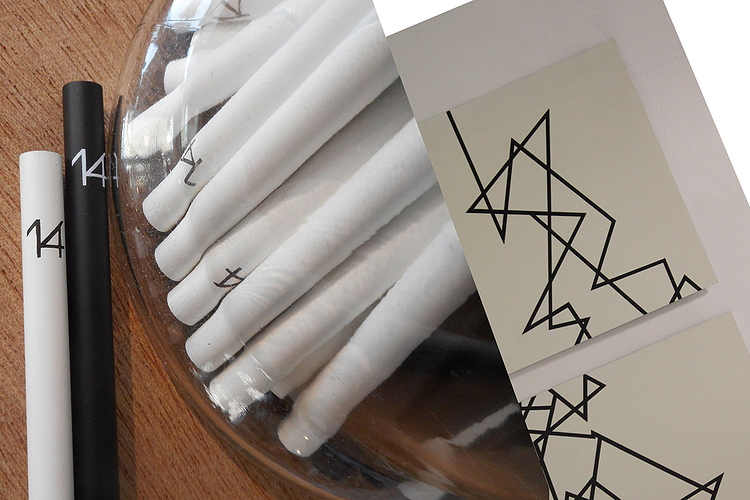
documenta 14 corporate design, as many other aspects of the exhibition, was the subject of discussion, confusion and critique. Officially was released information that four agencies were hired to develop the design: Vier5, Ludovic Balland, Laurenz Brunner & Julia Born and Mevis & van Deursen, and all of them worked independently upon guidelines, received from the artistic director of documenta 14 Adam Szymczyk. This, however, does not explain an obvious similarity of two styles, developed by Ludovic Balland and Mevis & Van Deursen, as well as how line&circle design of key materials (such as a reader) is related to the central ideas of the project of documenta 14: aneducation and colonial discourse. Google search about Mevis & Van Deursen demonstrates that the agency has worked before with abstract forms in design, at the same time there is no consistent style in their works that gives reason to say that documenta 14 design is what they had been doing for 20 years before were hired by Adam Szymczyk. It is possible to say that Ludovic Balland has own, recognizable style in design that is, however, different from what he has designed for documenta 14: his previous works are more variable and rich on details and text, comparing to solid, minimalistic and “heavy” industrial shapes that appeared in documenta 14 design. In a beautiful article on design of documenta 14 reader Ludovic Balland provides many details on how the reader was structured, however no drawings or sketches that illustrate development of typography of “14”, as well as overall cover design that upon his idea was meant to look “like a lump of raw material from a large building site.”
documenta 14 corporate design
I’m Mariya Pavlenko, a Ukrainian artist located in Kyiv (Ukraine) and Wroclaw (Poland). During the visit of the preview for artists in Kassel I had recognized fragments of my works in design materials of the exhibition and was obviously confused. For this reason I contacted documenta 14 team - in my claim I articulated strong wish to understand till the end of the project of documenta 14, if what I had seen was a coincidence, a misunderstanding or a conceptual gesture. documenta 14 officially ended on 17th of September. As long as I have not received any answer by now, I find important to open this situation to the public (at least for my further artistic practice).
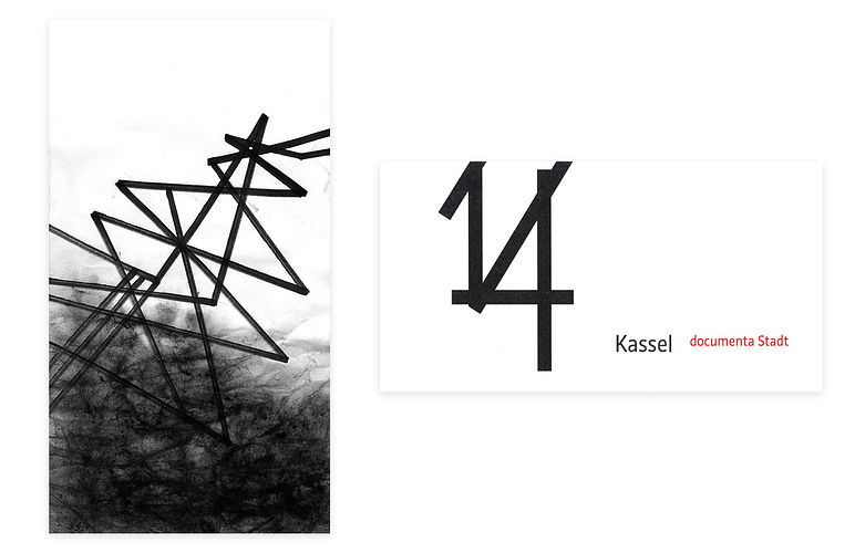
On the left: Above the sea, 2010. On the right: Invitation to the press reception in the City Hall of Kassel, 2017.
To clarify situation from my side, I would like to state openly that I did not authorize usage of my works as a leitmotif of corporate style of documenta 14. Projects, assumable used for the design of documenta materials, have concepts that does not obviously related to the central ideas of the project of documenta 14, particularly I speak about my projects “Industial” and "Snow City”. I have been working over these projects from 2008 in Kyiv, where my works were exhibited at different venues, such as Mala Galereya of Mystetslyi Arsenal, Mystetskyi Arsenal and Institutskaya gallery. In 2011 the projects were supported by grant of i3 foundation. In 2015 I was invited to create the work “Fragment (from Industrial project)” for the School of Kyiv Biennial, curated by Georg Schöllhammer and Hedwig Saxenhuber. My web-site provides detailed overview of my education and previous artistic practice.
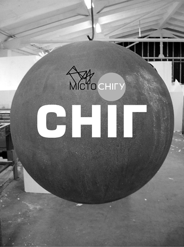
Front side of the invitation to the exhibition “Snow” at Mala Galereya of Mystetskyi Arsenal, February 2012
What I assume might have been prolonged in documenta 14 corporate style is the visual part of “Industrial” and “Snow City” projects - specific combination of angle-shaped line marker graphics and massive spheres that at the essence of my graphical style. Also many of my works form diptychs and triptychs that as well was similar in design and allocation of signboards in Kassel. Whether this situation introduces discourse on violence of the last issue of the South journal, outcome of a coincidence, flow of energy that Adam Szymczyk managed to catch during the visit of the School of Kyiv Biennial or a conceptual gesture on appropriation by colonial art images from indigenous cultures – I pass an initiative to reflect on this to an audience, art-critics and art-historians. After a long period of thinking (that was also prolonged by a media wave around documenta 14’s budget) I open this situation to the public, in a moment when the show is over and nothing can be added either removed. Making situation public, I start a discussion rather than a battle for ownership: I realize difficulty of definition of such terms as “authenticity” and “author” in the culture, based on remixes and shares in social networks. Nevertheless, the decision is inherent to my artistic practice and political position as an artist, who is concerned about a value of a labor and rights in a relationship with an institution.
In a series of collages I would like to provide more details about my concerns.
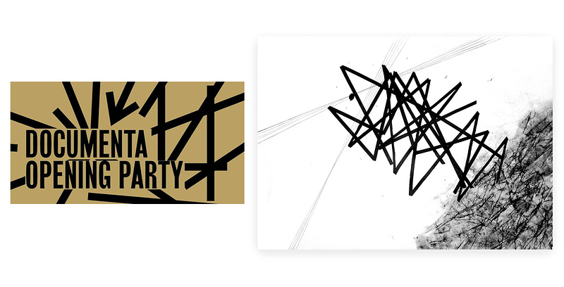
On the left: image from facebook page of documenta 14. On the right: Above the sea, 2010.
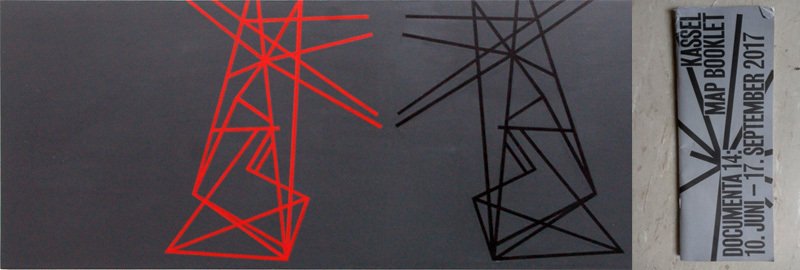
On the left: Tangent Tower, 2010. On the right: documenta 14 booklet cover.
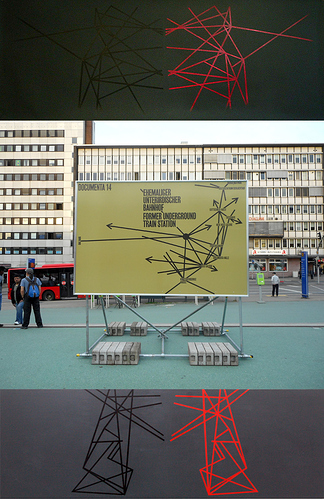
Up and down: Tangent Towers, diptych, 2010. Center: banner at Hauptbahnhof, Kassel.
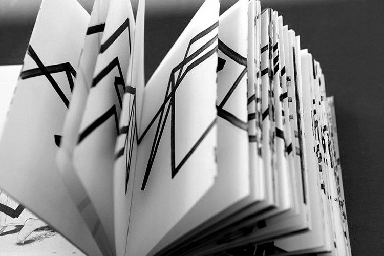
Industrial diary, 2012.
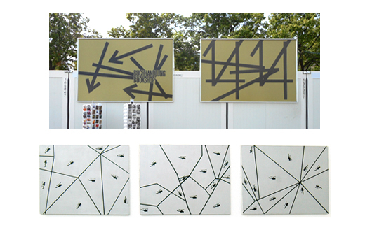
On the top: bookshop signboard (diptych?), on the bottom: helicopters (triptych), 2010
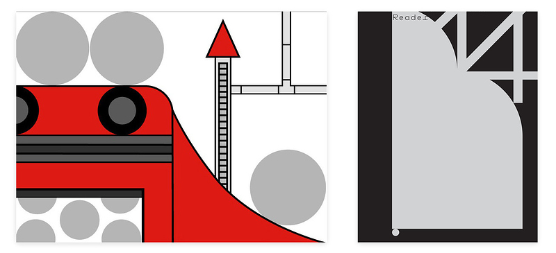
On the left: Snow Factory, 2012. On the right: documenta 14 reader cover.
Snow Factory, 2012.
On the left: documenta 14 reader, on the right: fragment of work Snow Factory, 2012.
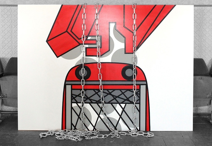
On the left: plakat at documenta 14 shop. On the right: installation “Snow”, 2012.
On the left: Monument, 2011. On the right: image from facebook page of documenta 14.
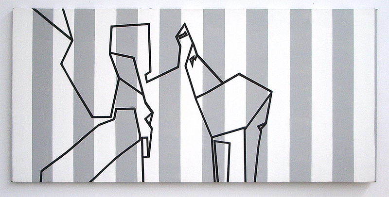
On the left: souvenir production at documenta 14 shop. On the right: diptych City fragments, 2011-2012.
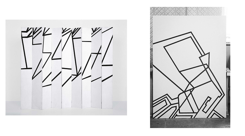
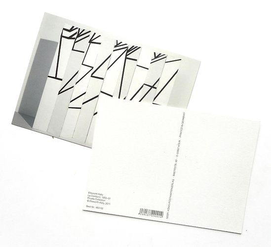
On the left: post card with a work, signed as Ellworth Kelly at documenta 14 shop. On the right: City fragment, 2011.
City fragment, 2009-2010.
Ellsworth Kelly, La Combe-II, postcard from documenta 14 shop.
09.10.2017
Mariya Pavlenko
