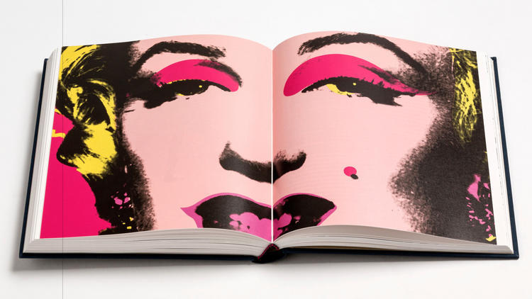
Writing for the Jacket Copy blog of the LA Times, Carolina A. Miranda traces the resurgent interest in expensive, heavy, lavishly illustrated art catalogues. This trend has been accompanied by solid revenue for independent book stores in recent years, after they seemed to be heading towards extinction. Apparently the pervasive digitization of media in all its forms has led to a counter-desire for old-fashioned tactile objects. Here’s an excerpt from Miranda’s article:
According to Publisher Alley, an industry trade group that analyzes sales data, glossy art books devoted to museum exhibitions and permanent collections have kept pace with, and occasionally bested, the growth rate of print publishing sales over the last four years. It’s impressive for an area of publishing that produces books that are expensive, impractical and very heavy.
A short stack of catalogs for the Hammer Museum exhibition “Leap Before You Look: Black Mountain College, 1933-1957,” San Francisco Museum of Modern Art’s upcoming photographic show “Anthony Hernandez,” and “Three Centuries of American Prints,” from the National Gallery of Art in Washington, D.C., weighs in at more than 15 pounds — about the equivalent of a bowling ball.
This excess is partly due to the fact that the medium of print works exceedingly well for the message of art — which in many cases is all about the aesthetics.
Glossy, oversize pages allow for the presentation of lush imagery in ways that are sharper and more engaging than the pixelated sameness of the Web, says Sharon Gallagher, founder of Artbook/D.A.P., a publisher and distributor.
“If you want to linger at a page, read a bit of text, turn back and look at the image again — if you want to look at something multiple times,” says Gallagher, “if you want to bring in design elements that structure visuals and texts in ways that speak to the subject at hand, so far, the e-book hasn’t gotten there.
“The best of the museum publications are ones where a very talented staff member, or perhaps an outside designer, spend six months studying the works and come up with a range of graphic treatments to offer an interpretation,” she adds. “It’s not just throwing everything into an HTML template.”